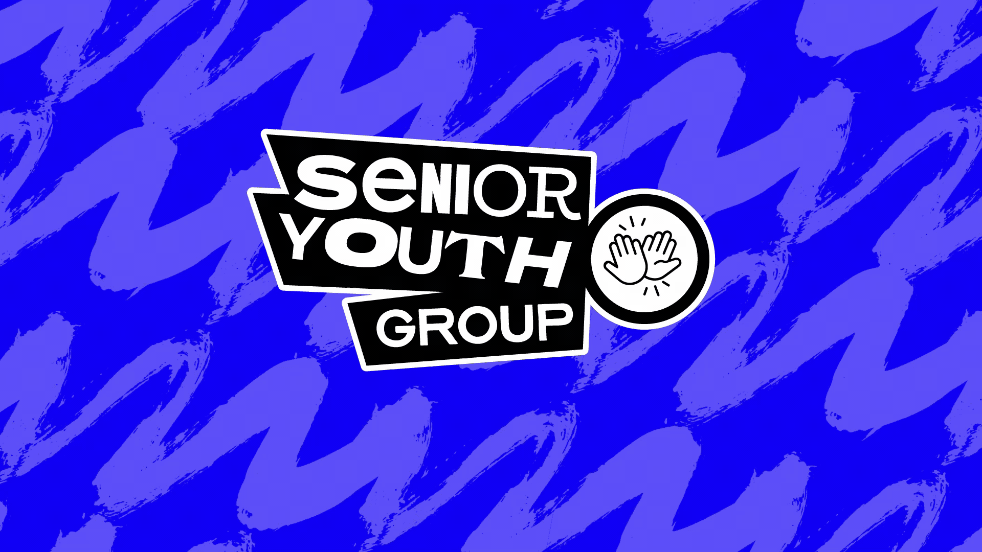
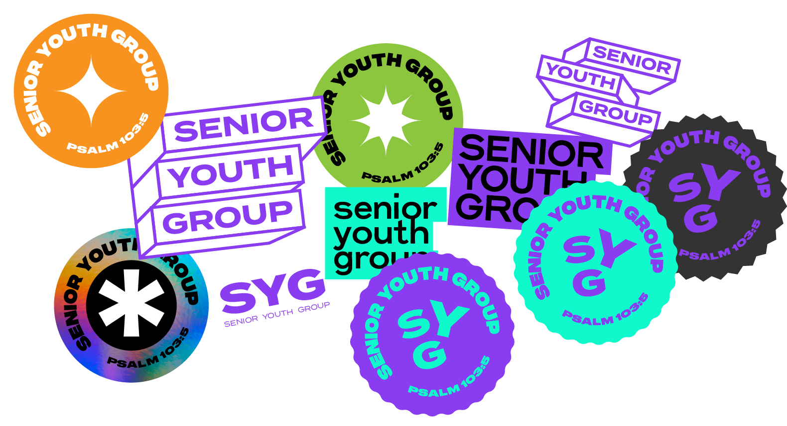
The youth cub needed a visual identity that resonated with a senior youth demographic. The goal was to shed the traditional, institutional feel often associated with community centers and create a brand that felt relevant, energetic, and owned by the members. They needed a system flexible enough to work on everything from printed event flyers to animated Instagram stories.
We moved away from static, corporate design and embraced a "digital-first" aesthetic. The new logo is built on the concept of kinetic energy—capturing the fun and movement of the club's activities.
Vibrant Palette: We utilized a high-contrast color scheme designed to pop on screens and stand out in print. The colors signal that this is a space for fun, not just a service.
Built for Motion: Knowing that the target audience lives on mobile, the logo was designed with animation in mind. The shapes and typography are modular, allowing them to expand, contract, and move in video content.
Total Versatility: The resulting identity is scalable. It holds its integrity whether stamped on a piece of merchandise, printed on a large-format banner, or animated as a loading screen for the club’s app.
COPYRIGHT
-
© 2024 GetSteve